top of page
Text Marquee
A look at a few print pieces. I had total creative direction over all of these designs, which span everything from standard print collateral to comprehensive branding guides and detailed brochures.
Click on each image to learn more about it
print & other

01
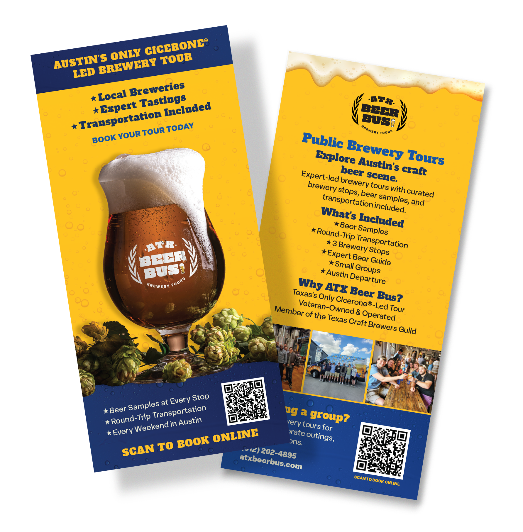
ATX Beer Bus rack card
This rack card for ATX Beer Bus was designed to give potential customers a quick breakdown of their brewery tours. It highlights key details like their Cicerone-led tastings and round-trip transportation, making it easy for people to see exactly what the experience is all about.

02
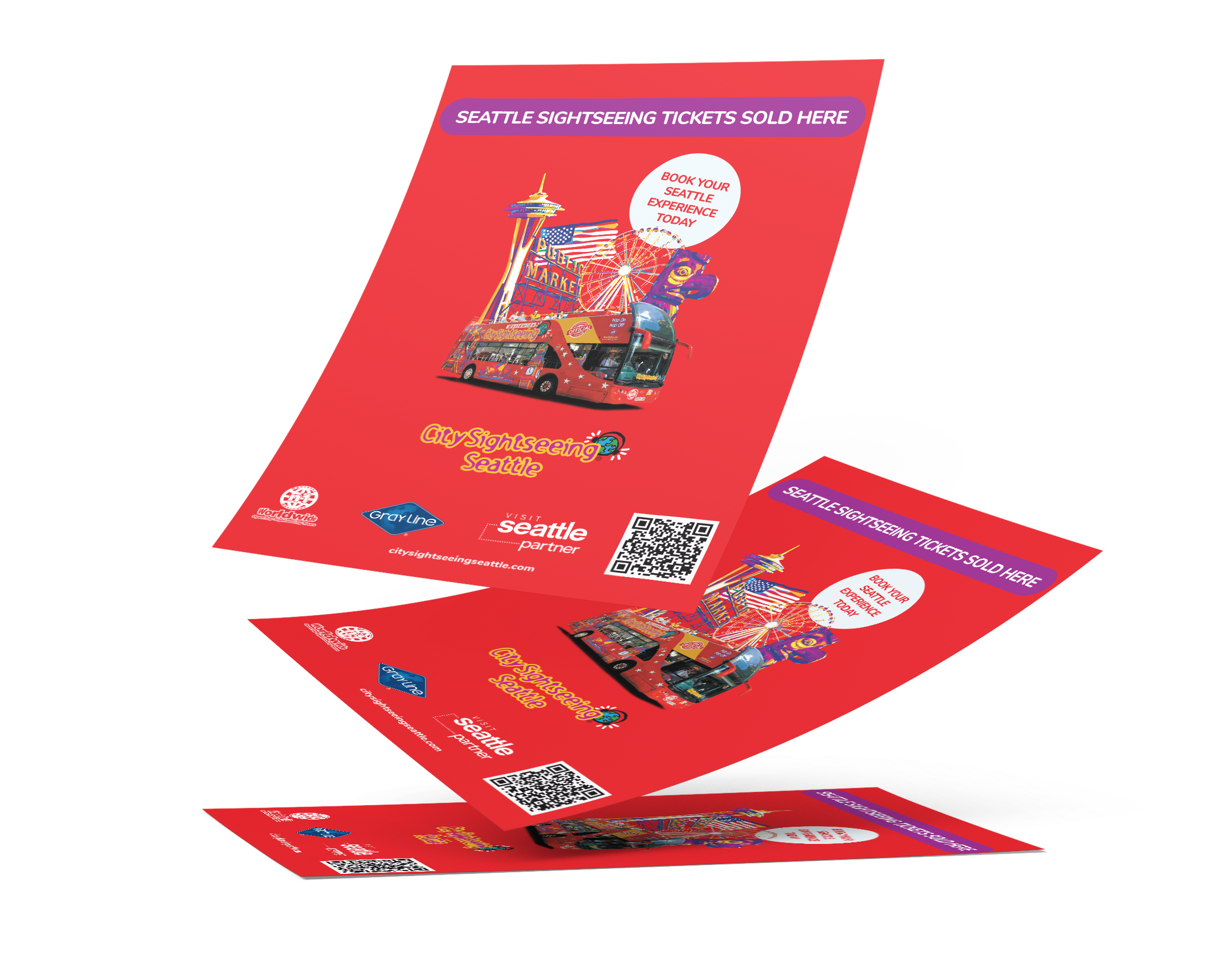
City Sightseeing Seattle flyer
For this City Sightseeing Seattle project, the goal was immediate convenience. The flyer, which doubles as an A-frame sign, highlights classic Seattle landmarks like the Space Needle and Public Market alongside a highly visible QR code. This setup drives quick, hassle-free ticket sales directly from the street.

03
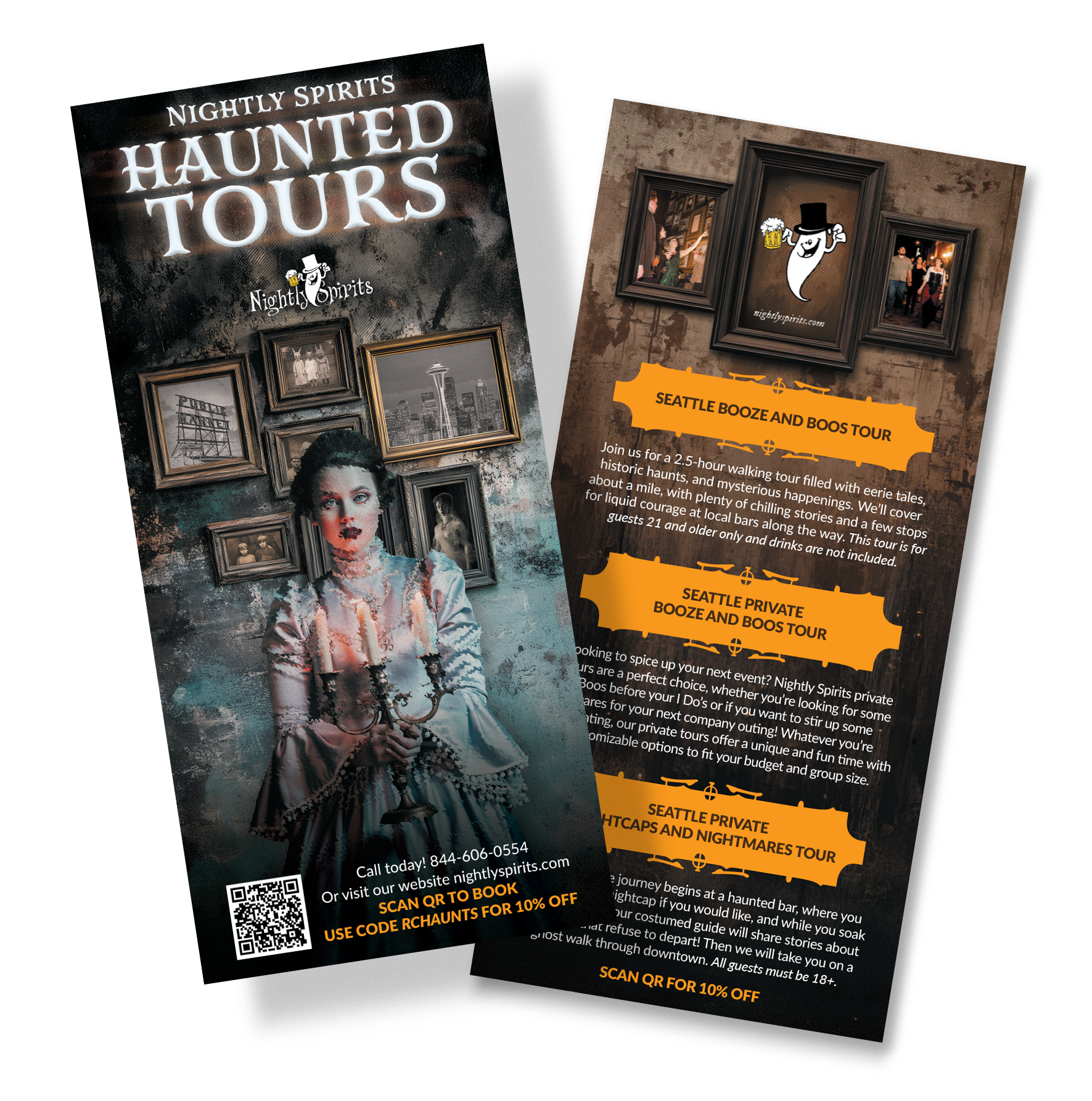
Nightly Spirits rack card
This rack card was created as part of a multi-city roll-out covering 21 locations for Nightly Spirits. While the template maintains a consistent aesthetic across all markets, the localized imagery and tour descriptions were customized to highlight the specific haunted pub crawls offered in each city.

04
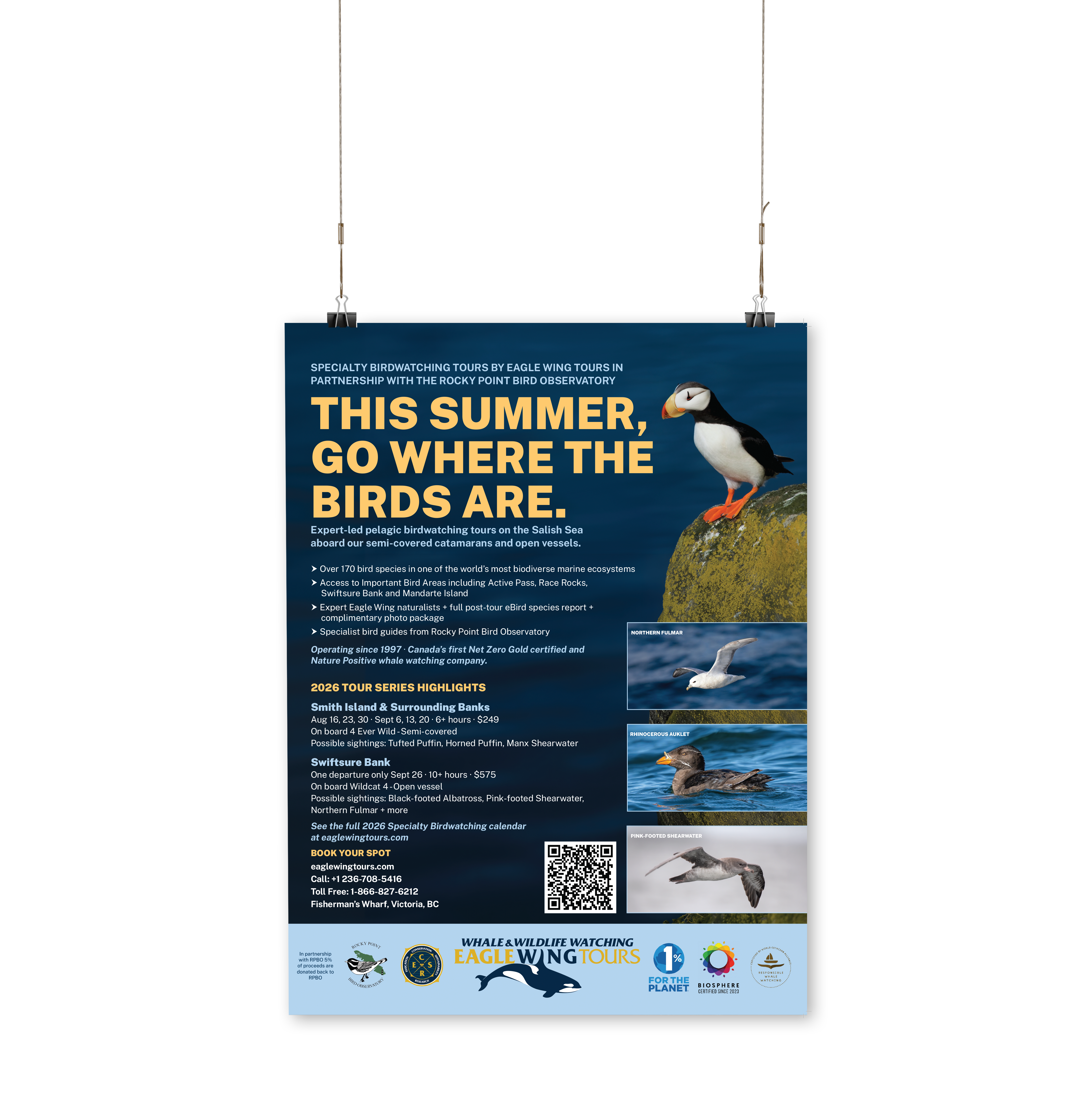
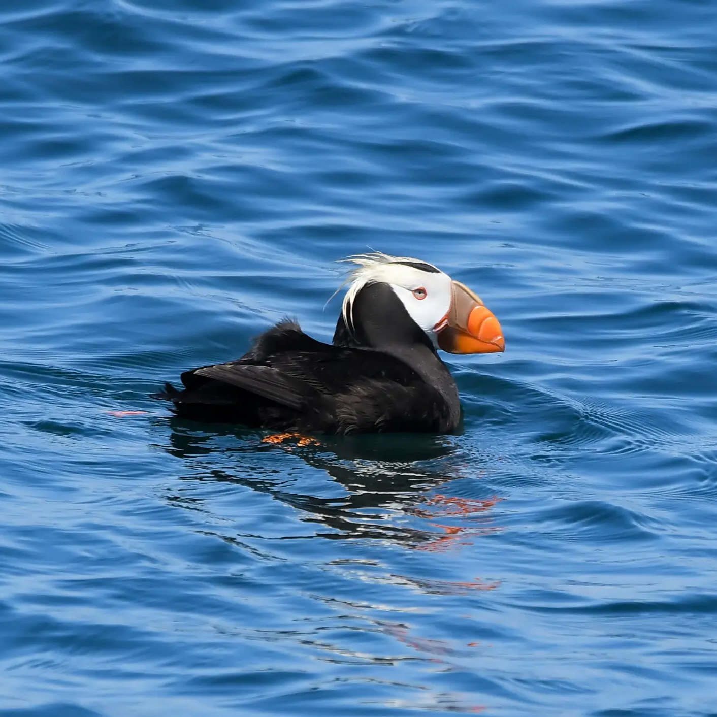
Eagle Wing poster
This promotional poster was created to market specialty birdwatching excursions for Eagle Wing Tours in partnership with the Rocky Point Bird Observatory.

05
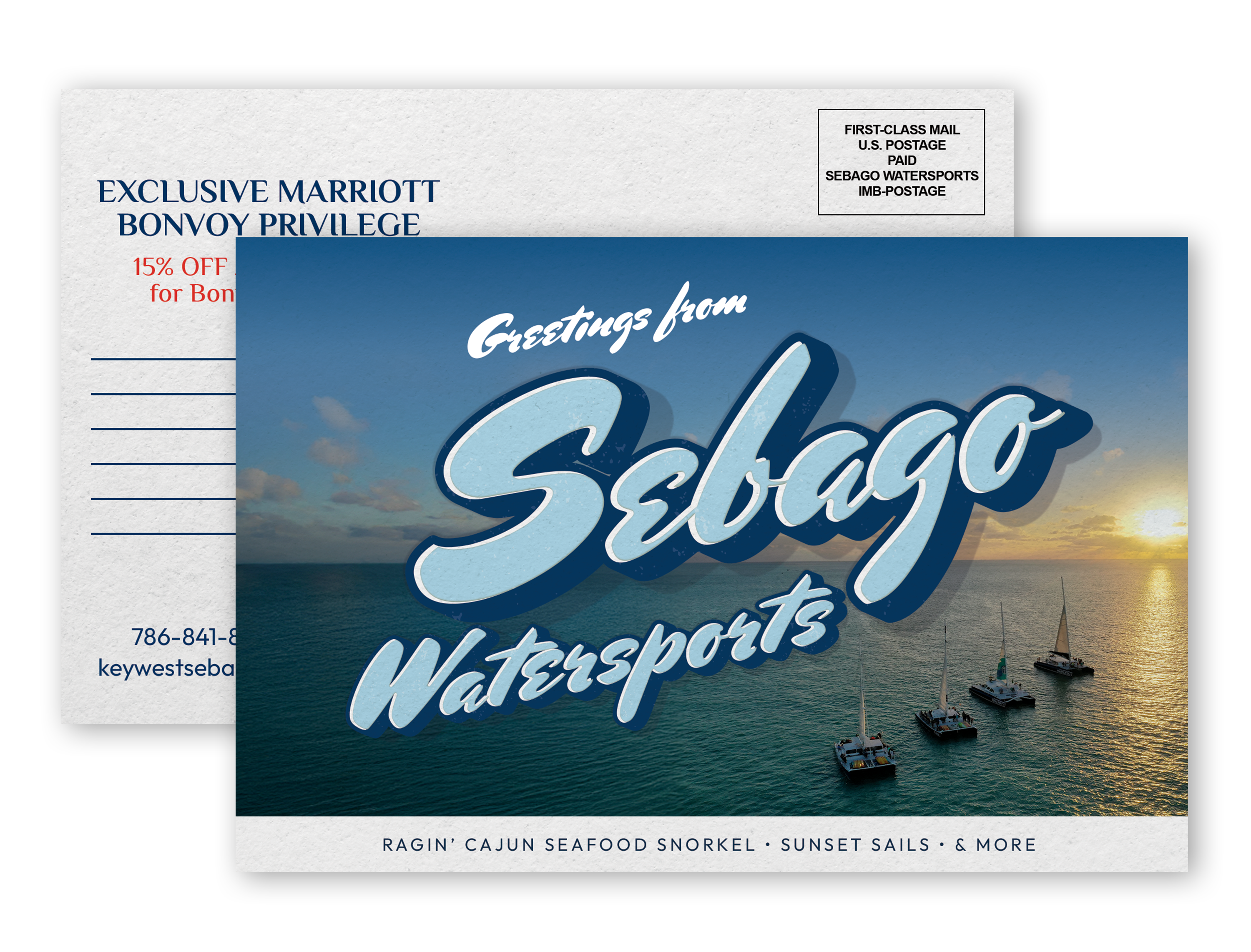
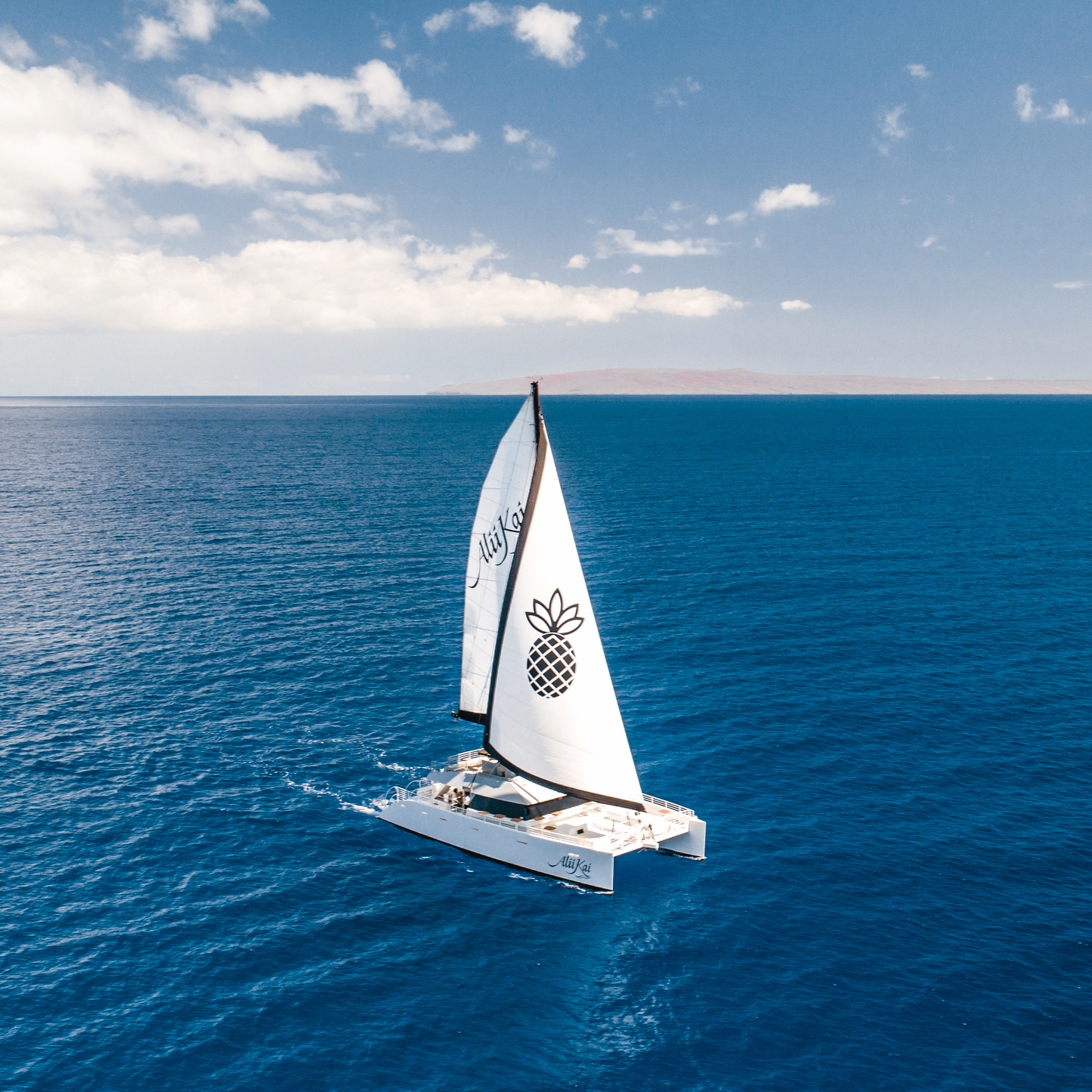
Sebago Watersports postcard
Created as part of a campaign targeting Marriott Bonvoy members, this postcard for Sebago Watersports promotes an exclusive discount for guests. The front leans into a retro typography style set against aerial photography of their sunset sails, serving as one of multiple variations designed for this promotion.
01 / 05
ATX Beer Bus rack card
This rack card for ATX Beer Bus was designed to give potential customers a quick breakdown of their brewery tours. It highlights key details like their Cicerone-led tastings and round-trip transportation, making it easy for people to see exactly what the experience is all about.
01
ATX Beer Bus rack card
This rack card for ATX Beer Bus was designed to give potential customers a quick breakdown of their brewery tours. It highlights key details like their Cicerone-led tastings and round-trip transportation, making it easy for people to see exactly what the experience is all about.
02
City Sightseeing Seattle flyer
For this City Sightseeing Seattle project, the goal was immediate convenience. The flyer, which doubles as an A-frame sign, highlights classic Seattle landmarks like the Space Needle and Public Market alongside a highly visible QR code. This setup drives quick, hassle-free ticket sales directly from the street.
03
Nightly Spirits rack card
This rack card was created as part of a multi-city roll-out covering 21 locations for Nightly Spirits. While the template maintains a consistent aesthetic across all markets, the localized imagery and tour descriptions were customized to highlight the specific haunted pub crawls offered in each city.
04
Eagle Wing poster
This promotional poster was created to market specialty birdwatching excursions for Eagle Wing Tours in partnership with the Rocky Point Bird Observatory.
05
Sebago Watersports postcard
Created as part of a campaign targeting Marriott Bonvoy members, this postcard for Sebago Watersports promotes an exclusive discount for guests. The front leans into a retro typography style set against aerial photography of their sunset sails, serving as one of multiple variations designed for this promotion.

01
GoCar branding guide
For the GoCar Tours branding guide, the goal was to build a solid foundation for their visual assets. I established a structured typography system, additionally, I updated their core color palette by bringing in a brighter yellow to give the brand more flexibility across digital and print platforms.

02
City Sightseeing LA brochure
The client’s previous brochure was filled with outdated and repetitive information across its panels, so we completely restructured the layout to remove the clutter and irrelevant details. The new City Sightseeing LA guide has a clean, modern look centered around a newly simplified route map created by Maria Mestre and Andrea Cortez, to make it much easier for guests to understand. By neatly organizing the essential timetables, specialty tours, and app benefits into this straightforward format, the brochure is now a clear, easy-to-use tool for exploring the city.

03
RED Hospitality branding guide
For the RED Hospitality & Leisure branding guide, the main goal was to bring all of their individual excursion companies under one unified visual identity. The rebrand establishes a shared primary color foundation paired with specific accent colors for each individual location. It also introduces a standard typography system to maintain consistency across all materials. To tie the entire visual system together, the guide lays out clear rules for photography and straightforward layout structures across their social media, print brochures, and websites.

04
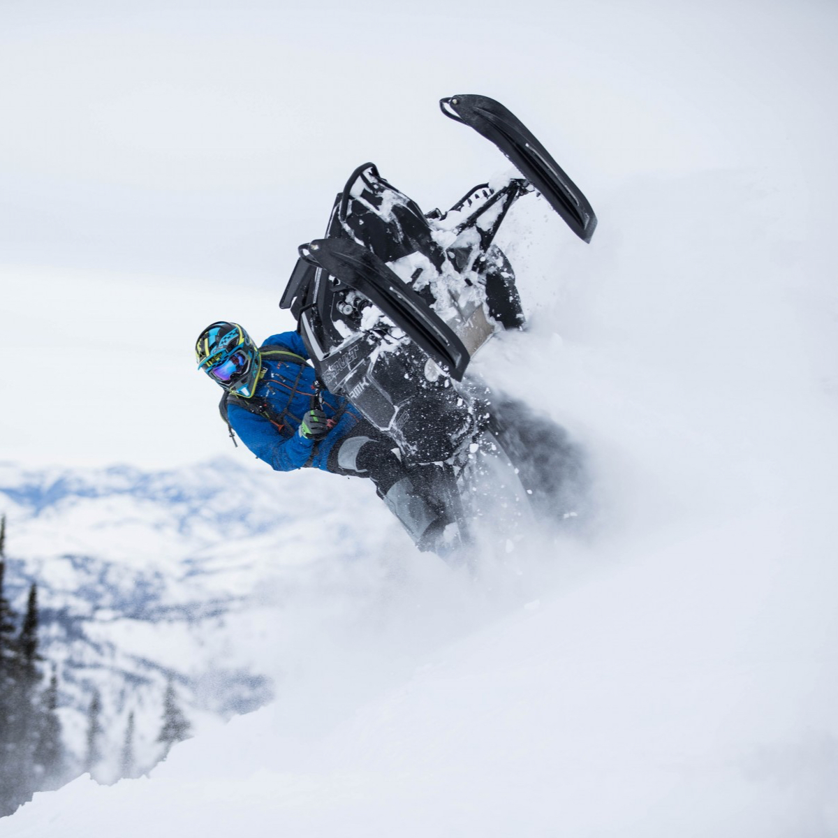
Thunderstruck case study
Here’s a case study I designed for AAMP Agency featuring Thunderstruck Adventures. Along with putting this document together, I crafted all the mockups and various creative assets across the aamp website. To see more of my agency work, head over to aamp.agency/case-studies/

05
Ali'i Nui brochure
As part of the overall rebrand, I designed this brochure for Ali'i Nui Maui using a cleaner, more structured layout that aligns with RED Hospitality’s new visual guidelines.

06
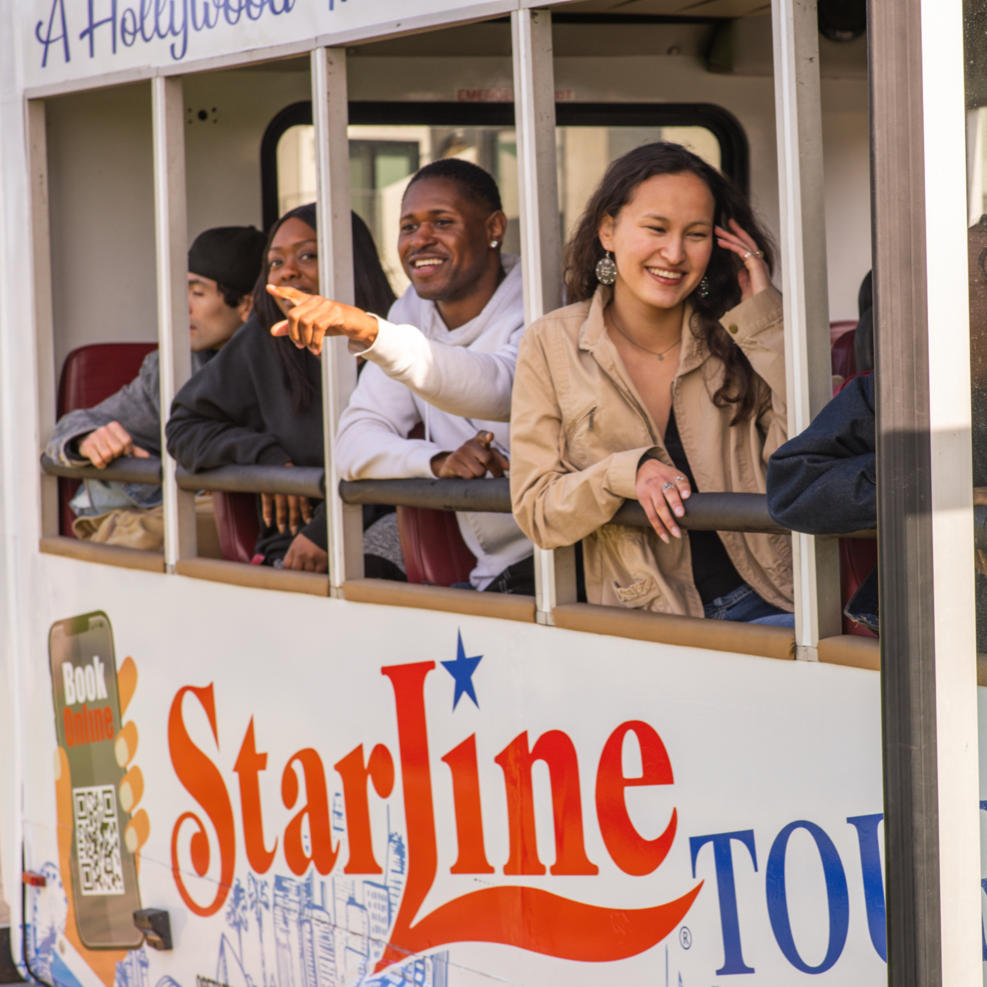
Starline branding guide
To give Starline Tours a fresh, modern look, I helped rebrand the iconic company with updated typography, a vibrant color palette, and clear visual guidelines. This brand guide establishes the structure and consistency they previously lacked while helping them connect with a younger audience.

07
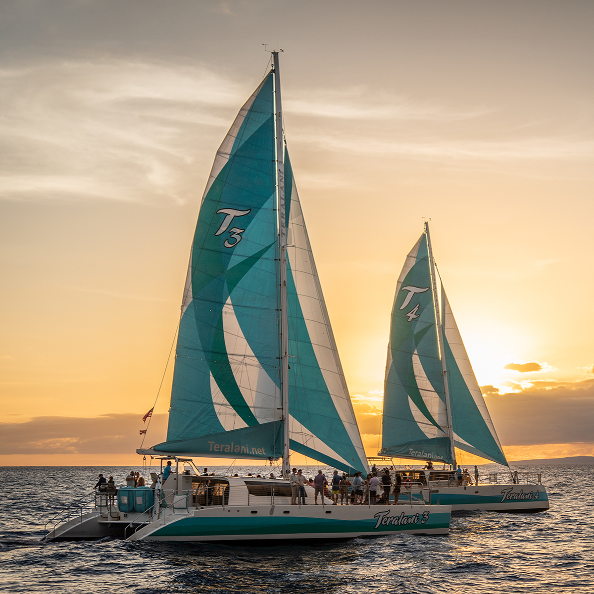
Teralani branding guide
To give Teralani Sailing Adventures a consistent visual identity, we streamlined their typography and refreshed their existing colors into a structured palette. The resulting brand guide covers everything from web components and social ads to boat graphics and lifestyle imagery.

08
Eagle Wing flat sheet
This dual-purpose flat sheet gives guests a complete breakdown of Eagle Wing Tours, covering everything from their whale guarantee and fleet options to their sustainability efforts. Built to work as both an informative flyer and a display poster, it presents a high volume of information in an engaging format.

09
aamp Christmas calendar
A Christmas calendar of events I crated for aamp
01 / 09
GoCar branding guide
For the GoCar Tours branding guide, the goal was to build a solid foundation for their visual assets. I established a structured typography system, additionally, I updated their core color palette by bringing in a brighter yellow to give the brand more flexibility across digital and print platforms.
Go to link01
GoCar branding guide
For the GoCar Tours branding guide, the goal was to build a solid foundation for their visual assets. I established a structured typography system, additionally, I updated their core color palette by bringing in a brighter yellow to give the brand more flexibility across digital and print platforms.
02
City Sightseeing LA brochure
The client’s previous brochure was filled with outdated and repetitive information across its panels, so we completely restructured the layout to remove the clutter and irrelevant details. The new City Sightseeing LA guide has a clean, modern look centered around a newly simplified route map created by Maria Mestre and Andrea Cortez, to make it much easier for guests to understand. By neatly organizing the essential timetables, specialty tours, and app benefits into this straightforward format, the brochure is now a clear, easy-to-use tool for exploring the city.
03
RED Hospitality branding guide
For the RED Hospitality & Leisure branding guide, the main goal was to bring all of their individual excursion companies under one unified visual identity. The rebrand establishes a shared primary color foundation paired with specific accent colors for each individual location. It also introduces a standard typography system to maintain consistency across all materials. To tie the entire visual system together, the guide lays out clear rules for photography and straightforward layout structures across their social media, print brochures, and websites.
04
Thunderstruck case study
Here’s a case study I designed for AAMP Agency featuring Thunderstruck Adventures. Along with putting this document together, I crafted all the mockups and various creative assets across the aamp website. To see more of my agency work, head over to aamp.agency/case-studies/
05
Ali'i Nui brochure
As part of the overall rebrand, I designed this brochure for Ali'i Nui Maui using a cleaner, more structured layout that aligns with RED Hospitality’s new visual guidelines.
06
Starline branding guide
To give Starline Tours a fresh, modern look, I helped rebrand the iconic company with updated typography, a vibrant color palette, and clear visual guidelines. This brand guide establishes the structure and consistency they previously lacked while helping them connect with a younger audience.
07
Teralani branding guide
To give Teralani Sailing Adventures a consistent visual identity, we streamlined their typography and refreshed their existing colors into a structured palette. The resulting brand guide covers everything from web components and social ads to boat graphics and lifestyle imagery.
08
Eagle Wing flat sheet
This dual-purpose flat sheet gives guests a complete breakdown of Eagle Wing Tours, covering everything from their whale guarantee and fleet options to their sustainability efforts. Built to work as both an informative flyer and a display poster, it presents a high volume of information in an engaging format.
09
aamp Christmas calendar
A Christmas calendar of events I crated for aamp
bottom of page