top of page
Text Marquee
A look at some of my favorite logo designs. I had total creative control on all of these, but they all started with a solid brief. I always like to ask clients a few key questions upfront to figure out their vision, color preferences, and the specific style they have in mind. It gives me the direction I need so I can take their ideas and just run with them. Every design shown here includes horizontal, stacked, and black-and-white versions.
Click on each image to learn more about it
logos

01
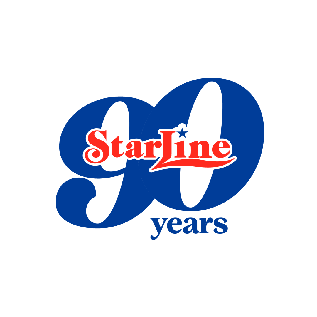
Starline 90th
For Starline Tours' 90th anniversary, the client wanted something memorable to celebrate a huge milestone. I focused heavily on the "90th" to make it stand out, while bringing in the "Starline" text from their iconic original logo—yes, the one you might recognize from Lana Del Rey's Honeymoon album cover. The design brings a great piece of their history back to life while still fitting perfectly into their new branding.

02
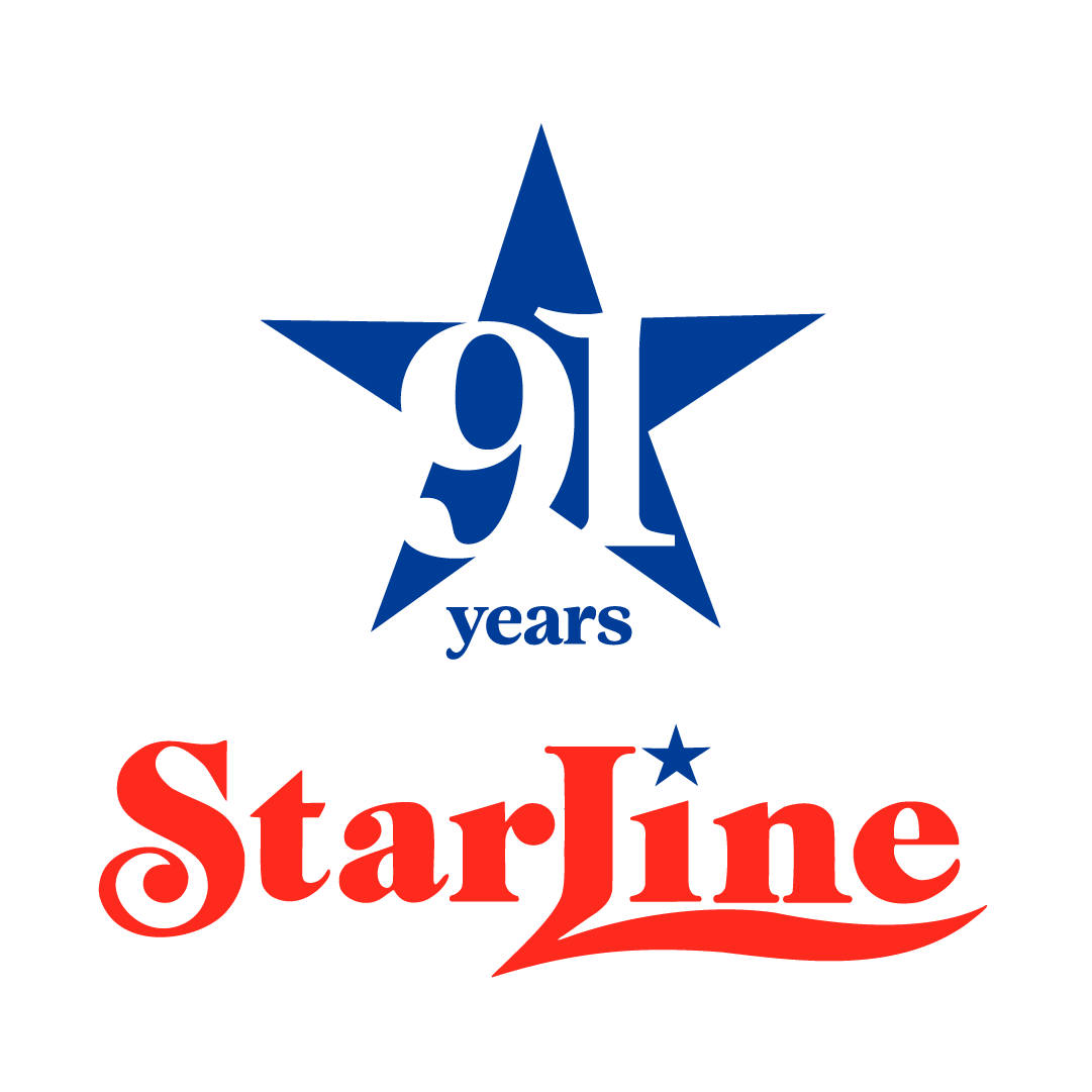
Starline 91
Following up on the 90th-anniversary design, the client wanted something fun to celebrate year 91. I took a similar approach by keeping the classic "Starline" lettering from their original logo, but gave it a fresh visual twist. I played with the negative space of a large star to make the "91st" really pop. The result highlights the new milestone while staying tied to their history.

03
Let's See Italy
The logo for Let's See Italy was built around the idea of keeping things bold and minimal. The client needed a design that tied in seamlessly with their newly updated website. By focusing on a simple and direct approach, the final logo gives the brand a strong, modern look without any unnecessary clutter.

04
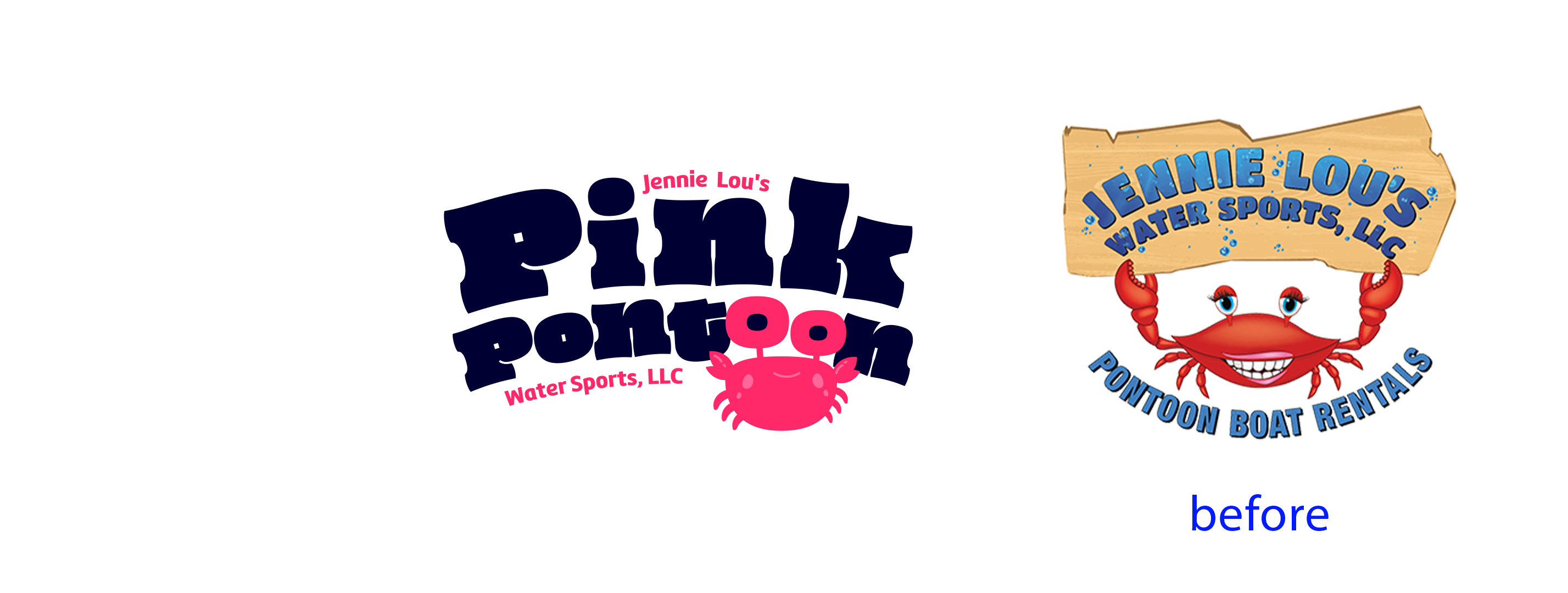
Pink Pontoon
For this project, the client wanted a refreshed and modern identity. I designed a playful new logo using modern typography to give the brand an updated feel. They wanted to keep their original crab mascot, so I reworked the design to be much more fun and approachable, getting rid of the smiley old crab they had.

05
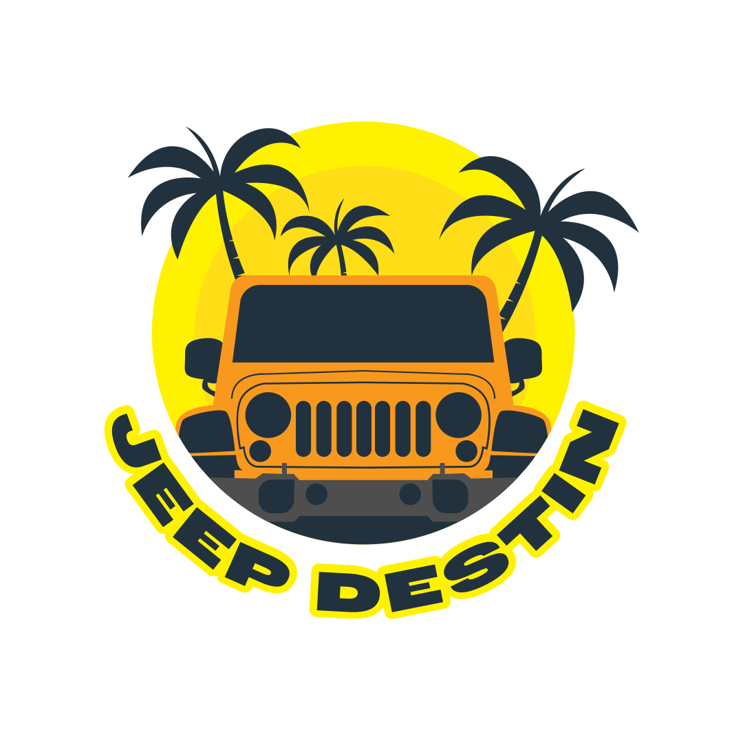
Jeep Destin
For this project, the client needed a logo for their new Jeep rental business. His main request was very clear: he specifically wanted a Jeep included in the design. I built the logo around that exact request, delivering a straightforward, bold design that gives the new business an instantly recognizable identity.

06
Bag Drop Nashville
As a sister company to Nashville’s popular Joy Ride, the Bag Drop Nashville logo was designed to immediately establish trust through brand recognition. The goal was to create a logo that felt unmistakably part of the Joy Ride family, yet distinct enough to stand on its own. By blending Joy Ride's familiar, energetic aesthetic with clear, clever iconography, the logo perfectly communicates the convenience of this free luggage storage service at The Green Light bar, helping visitors explore Music City unburdened.

07
Cabañas en Creel
This logo was created for a friend's cabin rental business in Creel, Chihuahua. The goal was to design something fun and modern that captures exactly what the business is all about: a relaxing cabin getaway surrounded by the beautiful forests of the Sierra Tarahumara.

08
Cork and Barrel
Cork and Barrel wanted an elaborate, vintage design that feels elevated. The deep browns and warm golds pull directly from the look of a traditional wine barrel. To bring the whole concept together, the detailed typography pairs with the ornate flourishes to give their hand-crafted wine tours a distinct, classic look.

09
Backyard Marketing Pros
The goal for the Backyard Marketing Pros logo was to keep things fun and dynamic. I added a house to the design to immediately communicate what the business does, resulting in a lively and straightforward identity.

10
Destin Adventure Rentals
For this water sports rental business, the client wanted a friendly and approachable design. I chose an aqua color palette to directly reflect Destin's famous blue waters and incorporated a large, fun sun to capture the energy of a day out on the water.

11
Sand Hollow Rentals
The client for Sand Hollow Rentals wanted to capture the Utah scenery, so I made the local landscape the focal point of the design. Highlighting the recognizable desert terrain gives the brand a strong, location-driven identity without feeling too busy.

12
Destin Adventure Tours
Much like the Jeep Destin project, this client came in with the request to include a Jeep in the logo. They were looking for an energetic and fun logo, so I made the vehicle the central focus and paired it with playful typography to match the lively vibe they wanted.

13
Ride N Drive
For Ride n Drive Off-Road Rentals, the goal was to create a design that immediately communicates the thrill of the trail. I built the logo using a fun UTV graphic and paired it with an energetic, dynamic font to match the fast-paced, adventurous spirit of their business.

14
Las Vegas Boat and Jet Ski
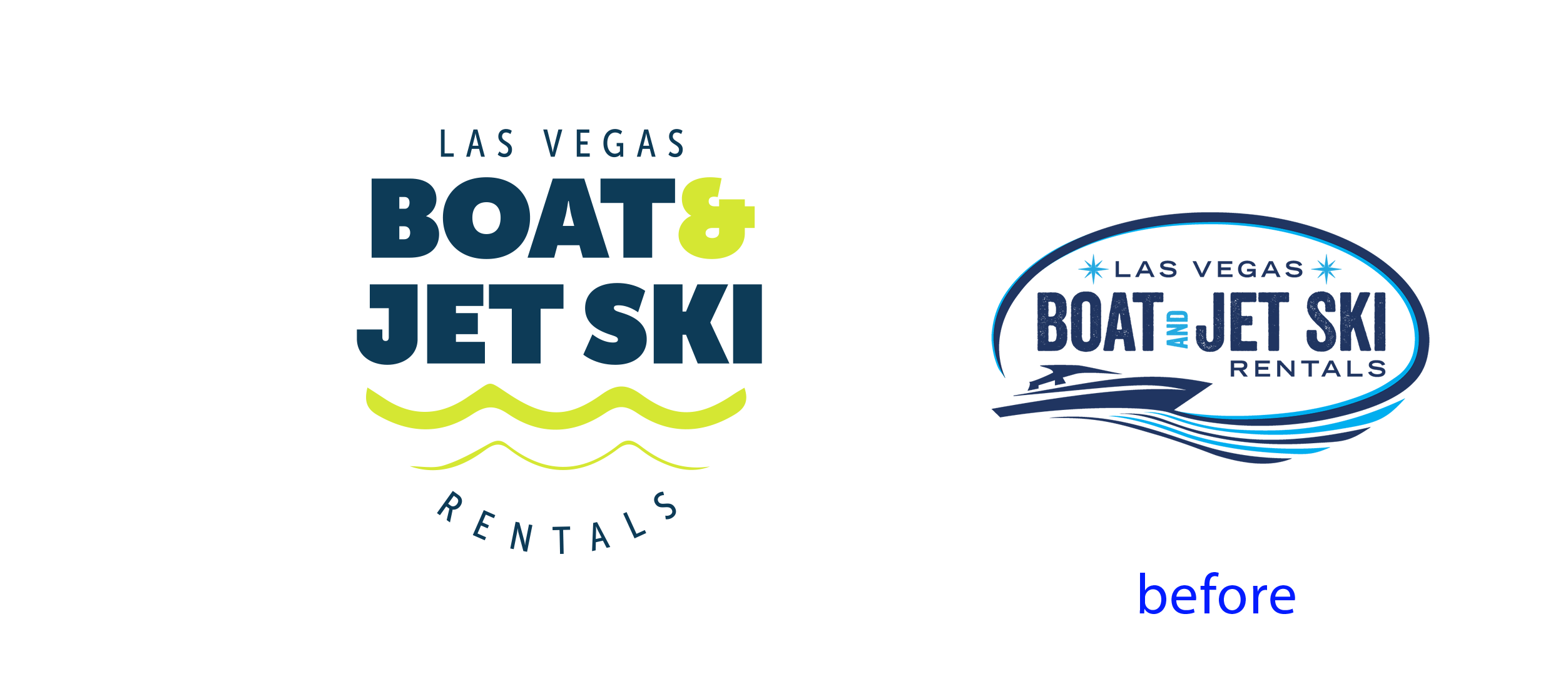
For Las Vegas Boat and Jet Ski, the client wanted a refreshed, modern look. To achieve this, I removed the icon from their old logo to create a cleaner layout and introduced a vibrant green to make the new design stand out.

15
Boatie's Watersports
The client requested a new logo featuring vibrant colors and a pontoon boat. To fully capture the Florida essence, I incorporated palm trees and a large sun in the background, creating a bright, energetic design that stands out.

16
aamp agency
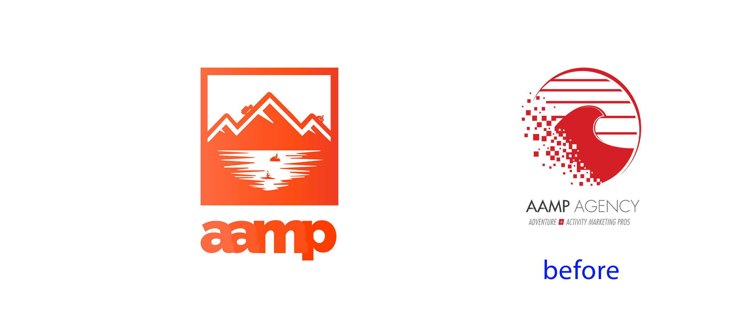
For the aamp rebranding, the goal was a clean, uncluttered design anchored by a fresh orange palette. We stripped the text down to just the "aamp" acronym, which gave us room to introduce a subtle landscape concept. If you look closely, you'll find tiny icons and easter eggs tucked away that represent the different tourism industries the agency specializes in.
01 / 16
Starline 90th
For Starline Tours' 90th anniversary, the client wanted something memorable to celebrate a huge milestone. I focused heavily on the "90th" to make it stand out, while bringing in the "Starline" text from their iconic original logo—yes, the one you might recognize from Lana Del Rey's Honeymoon album cover. The design brings a great piece of their history back to life while still fitting perfectly into their new branding.
starlinetours.com01
Starline 90th
For Starline Tours' 90th anniversary, the client wanted something memorable to celebrate a huge milestone. I focused heavily on the "90th" to make it stand out, while bringing in the "Starline" text from their iconic original logo—yes, the one you might recognize from Lana Del Rey's Honeymoon album cover. The design brings a great piece of their history back to life while still fitting perfectly into their new branding.
02
Starline 91
Following up on the 90th-anniversary design, the client wanted something fun to celebrate year 91. I took a similar approach by keeping the classic "Starline" lettering from their original logo, but gave it a fresh visual twist. I played with the negative space of a large star to make the "91st" really pop. The result highlights the new milestone while staying tied to their history.
03
Let's See Italy
The logo for Let's See Italy was built around the idea of keeping things bold and minimal. The client needed a design that tied in seamlessly with their newly updated website. By focusing on a simple and direct approach, the final logo gives the brand a strong, modern look without any unnecessary clutter.
04
Pink Pontoon
For this project, the client wanted a refreshed and modern identity. I designed a playful new logo using modern typography to give the brand an updated feel. They wanted to keep their original crab mascot, so I reworked the design to be much more fun and approachable, getting rid of the smiley old crab they had.
05
Jeep Destin
For this project, the client needed a logo for their new Jeep rental business. His main request was very clear: he specifically wanted a Jeep included in the design. I built the logo around that exact request, delivering a straightforward, bold design that gives the new business an instantly recognizable identity.
06
Bag Drop Nashville
As a sister company to Nashville’s popular Joy Ride, the Bag Drop Nashville logo was designed to immediately establish trust through brand recognition. The goal was to create a logo that felt unmistakably part of the Joy Ride family, yet distinct enough to stand on its own. By blending Joy Ride's familiar, energetic aesthetic with clear, clever iconography, the logo perfectly communicates the convenience of this free luggage storage service at The Green Light bar, helping visitors explore Music City unburdened.
07
Cabañas en Creel
This logo was created for a friend's cabin rental business in Creel, Chihuahua. The goal was to design something fun and modern that captures exactly what the business is all about: a relaxing cabin getaway surrounded by the beautiful forests of the Sierra Tarahumara.
08
Cork and Barrel
Cork and Barrel wanted an elaborate, vintage design that feels elevated. The deep browns and warm golds pull directly from the look of a traditional wine barrel. To bring the whole concept together, the detailed typography pairs with the ornate flourishes to give their hand-crafted wine tours a distinct, classic look.
09
Backyard Marketing Pros
The goal for the Backyard Marketing Pros logo was to keep things fun and dynamic. I added a house to the design to immediately communicate what the business does, resulting in a lively and straightforward identity.
10
Destin Adventure Rentals
For this water sports rental business, the client wanted a friendly and approachable design. I chose an aqua color palette to directly reflect Destin's famous blue waters and incorporated a large, fun sun to capture the energy of a day out on the water.
11
Sand Hollow Rentals
The client for Sand Hollow Rentals wanted to capture the Utah scenery, so I made the local landscape the focal point of the design. Highlighting the recognizable desert terrain gives the brand a strong, location-driven identity without feeling too busy.
12
Destin Adventure Tours
Much like the Jeep Destin project, this client came in with the request to include a Jeep in the logo. They were looking for an energetic and fun logo, so I made the vehicle the central focus and paired it with playful typography to match the lively vibe they wanted.
13
Ride N Drive
For Ride n Drive Off-Road Rentals, the goal was to create a design that immediately communicates the thrill of the trail. I built the logo using a fun UTV graphic and paired it with an energetic, dynamic font to match the fast-paced, adventurous spirit of their business.
14
Las Vegas Boat and Jet Ski
For Las Vegas Boat and Jet Ski, the client wanted a refreshed, modern look. To achieve this, I removed the icon from their old logo to create a cleaner layout and introduced a vibrant green to make the new design stand out.
15
Boatie's Watersports
The client requested a new logo featuring vibrant colors and a pontoon boat. To fully capture the Florida essence, I incorporated palm trees and a large sun in the background, creating a bright, energetic design that stands out.
16
aamp agency
For the aamp rebranding, the goal was a clean, uncluttered design anchored by a fresh orange palette. We stripped the text down to just the "aamp" acronym, which gave us room to introduce a subtle landscape concept. If you look closely, you'll find tiny icons and easter eggs tucked away that represent the different tourism industries the agency specializes in.

bottom of page